

Pinball Machines Database
Use our searchable pinball machine database to find info about the pinball game you're looking for. Find games by manufacturer, design team, tutorial availability, and more.
New! Check out our Pinball Mods & Toppers directory for all your mod and topper reference needs.

Search Pinball Machines
Use the search box to filter pinball games by keyword, the dropdown to filter by active manufacturer, or use the toggles to see if a game has an available tutorial or information on mods and toppers.
Pinball Manufacturers IndexThank you! Your submission has been received!
Oops! Something went wrong while submitting the form.
Sort by
Showing 0 of 100
Licensed
1970s
Movie
Sharks
Animals

JAWS
Stern Pinball Inc.
2024
87
Original Theme
Food
BBQ

Barry O's Barbecue Challenge
American Pinball
2024
64
Licensed
Movie
Module Game
P3
Adventure

The Princess Bride
Multimorphic
2024
30
Original Theme
Ninjas
Boutique Manufacturer

Ninja Eclipse
Turner Pinball
2024
94
Licensed
Music
Disco
Pop Music

ABBA
Pinball Brothers
2024
0
Licensed
Movie
Action
Guns

John Wick
Stern Pinball Inc.
2024
100
Licensed
Movie
Action
Adventure
Dinosaurs

Jurassic Park
Stern Pinball Inc.
2019
80
Original Theme
Weather
Storms
Tornado

Whirlwind
Williams Electronic Games Inc.
1990
82
Cartoon
Licensed
Mystery
Kids
Dogs

Scooby Doo
Spooky Pinball LLC
2023
78
Music
Rock Music
Band
90s
Cartoon

Foo Fighters
Stern Pinball Inc.
2023
85
Licensed
Movie
Crime
Drama
Gangster

The Godfather
Jersey Jack Pinball
2023
85
Movie
Licensed
90s
Drama
Adult themes

Pulp Fiction
Chicago Gaming Company
2023
88
Original Theme
Sci-Fi
Cyberpunk
Boutique Manufacturer

Final Resistance
Multimorphic
2023
100
Original Theme
Sci-Fi
Space
Boutique Manufacturer
Ice Cream

Galactic Tank Force
American Pinball
2023
90
Sci-Fi
Original Theme
Boutique Manufacturer
Upper Playfield

Space Hunt
HEXA Pinball
2023
100
Comedy
Humor
Original Theme
Boutique Manufacturer

Punny Factory
Pinball Adventures
2023
74
Marvel
Comics
Co-Op Mode
Superhero
Licensed

Venom
Stern Pinball Inc.
2023
92
Licensed
Fantasy
Kids
Movie
David Bowie

Jim Henson's Labyrinth
Barrels of Fun Pinball
2023
96
Licensed
Rock Music
Music
Pop Music

Elton John
Jersey Jack Pinball
2023
95
Conversion Kit
Licensed

Whirlwind: Total Chaos (Whirlwind 2.0)
Pedretti Gaming
2023
75
Licensed
Horror
Movie
1970s
Violence

The Texas Chainsaw Massacre
Spooky Pinball LLC
2023
88
Licensed
Cartoon
TV Show
Comedy

Looney Tunes
Spooky Pinball LLC
2023
61
Horror
Mini-Game
Original Theme
Module Game

Drained Bite-Sized
For Amusement Only
2023
50
Birds
Indie
Original Theme
Module Game

Bird Watcher
Ian Harrower Games
2023
50
Tower Defense
P3
Indie
Module Game
Original Theme

Dungeon Door Defender
2023
50
Original Theme
Single level playfield
Notable music
Sci-Fi
Modern Retro

Total Nuclear Annihilation
Spooky Pinball LLC
2017
79
Licensed
Movie
Spy
Action
Adventure

James Bond 007 60th Anniversary (LE)
Stern Pinball Inc.
2022
88
Licensed
Movie
Kids
Children
Family

Toy Story 4
Jersey Jack Pinball
2022
82
Band
Music
Rock Music
Licensed

Rush
Stern Pinball Inc.
2022
91
Music
Comedy
Licensed
Band
Musician

Weird Al's Museum of Natural Hilarity
Multimorphic
2022
50
Bally
Underwater
Ocean
Single level playfield

Fathom
Bally Manufacturing Co.
1981
82
Licensed
Movie
Spy
Action
Adventure

James Bond 007
Stern Pinball Inc.
2022
96
Original Theme
Home Pin
NFTs
Crypto

Escape From The Megaverse
Megaverse Project
2022
12
Music
Rock Music
Boutique Manufacturer
Licensed
Band

Queen
Pinball Brothers
2022
40
Original Theme
Module Game
Indie
Horror

Drained
For Amusement Only
2022
0
Movie
Comedy
80s
Music
Licensed

This is Spinal Tap
Homepin
2022
53
Original Theme
Module Game

Flipper Foxtrot Rhythm Explosion
Multimorphic
2022
0
Home Pin
Dinosaurs
Licensed
Movie

Jurassic Park (Home Edition)
Stern Pinball Inc.
2021
100
Licensed
Sci-Fi
Movie
Widebody
Space

Alien
Pinball Brothers
2016
80
Licensed
Action
Sci-Fi
Television
Movie

Ultraman: Kaiju Rumble
Spooky Pinball LLC
2021
100
TV Show
Star Wars
Disney
Licensed
Sci-Fi

The Mandalorian
Stern Pinball Inc.
2021
70
Licensed
Movie
Action
Sci-Fi

Godzilla
Stern Pinball Inc.
2021
91
Movie
Horror
Licensed
Holiday

Halloween
Spooky Pinball LLC
2021
71
Original Theme
Module Game
P3

Heads Up!
Multimorphic
2021
0
Vikings
Original Theme
Myth

Legends of Valhalla
American Pinball
2020
100
Original Theme
Module Game

Silver Falls
Multimorphic
2021
0
Original Theme
Module Game
P3

Sorcerer's Apprentice
Multimorphic
2021
0
Original Theme
Western
90s
Approachable
Bash Toy

Cactus Canyon
Bally Manufacturing Co.
1998
78
Original Theme
Module Game
P3

Quest for Glory
For Amusement Only
2021
0
Conversion Kit
Licensed

Funhouse Rudy's Nightmare
Pedretti Gaming
2021
57
Licensed
Home Pin
Music
Movie
Sci-Fi

Heavy Metal
Stern Pinball Inc.
2020
100
Licensed
Band
Music
Rock Music
Upper Playfield

Guns N' Roses
Jersey Jack Pinball
2020
83
Original Theme
P3
Module Game

ROCs
Multimorphic
2020
0
Original Theme
Module Game
P3

Shoot 'n Scoot
Multimorphic
2020
0
Original Theme
Myth
Single level playfield
Fantasy
Medieval

Celts
Haggis Pinball
2020
50
Licensed
Racing
Cars
Toy

Hot Wheels
American Pinball
2020
95
Licensed
Band
Rock Music
Music
Myth

Led Zeppelin
Stern Pinball Inc.
2020
76
Licensed
Cartoon
90s
Comics
Animated

Teenage Mutant Ninja Turtles
Stern Pinball Inc.
2020
75
Original Theme
Module Game
Indie
P3

Ranger in the Ruins
Multimorphic
2020
50
Licensed
Marvel
Comics
Animated
Superhero

Avengers: Infinity Quest
Stern Pinball Inc.
2020
90
Licensed
Television
Sci-Fi
Fantasy
Cartoon

Rick and Morty
Spooky Pinball LLC
2019
86
P3
Crime
Module Game
Original Theme

Heist
Multimorphic
2020
0
Original Theme
Knights
Pinball Franchise
Medieval
Metal Music

Black Knight: Sword of Rage
Stern Pinball Inc.
2019
78
Licensed
TV Show
Horror
Comedy
Lower Playfield
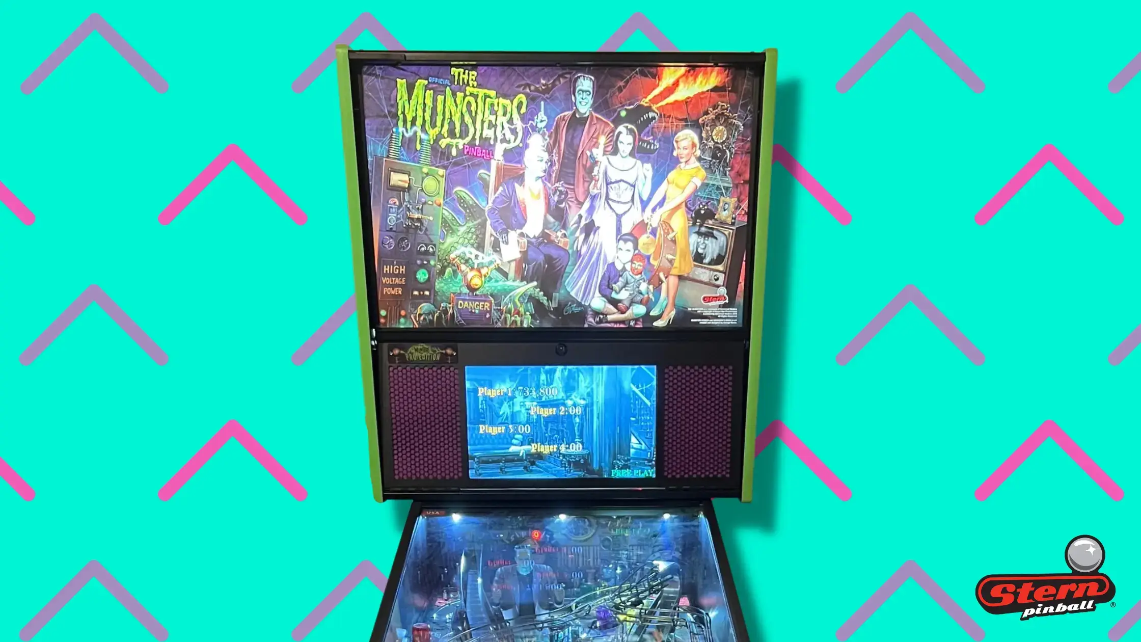
The Munsters
Stern Pinball Inc.
2019
80
Sports
Basketball
P3
Module Game
Original Theme

Hoopin' It Up
Multimorphic
2019
0
Licensed
Elvira
Horror
Comedy
Pinball Franchise

Elvira's House of Horrors
Stern Pinball Inc.
2019
91
Licensed
Movie
Family
Candy

Willy Wonka & The Chocolate Factory
Jersey Jack Pinball
2019
100
Licensed
TV Show
Netflix
Horror
Adventure

Stranger Things
Stern Pinball Inc.
2019
68
Licensed
Movie
Disney
Sci-Fi
Space

Star Wars
Stern Pinball Inc.
2017
84
Licensed
TV Show
Superhero
Comics
Crime

Batman 66
Stern Pinball Inc.
2016
62
Licensed
Home Pin
Star Wars
Disney
Space

Star Wars (Home Edition)
Stern Pinball Inc.
2019
70
Toy
Gimmick
Miniature

The Flip Side
American Girl
2019
0
Original Theme
Zombies

Retro Atomic Zombie Adventureland
deeproot
2019
0
Original Theme
Circus
Space

Cosmic Carnival
Suncoast Pinball
2019
0
No items found.

Super Canasta
Quetzal Pinball
2019
75
Licensed
Monsters
Movie
Horror
90s

Monster Bash
Williams Electronic Games Inc.
1998
94
Licensed
Marvel
Superhero
Comics
Fighting

Deadpool
Stern Pinball Inc.
2018
90
Licensed
Band
Music
Metal Music
Rock Music

Iron Maiden: Legacy of the Beast
Stern Pinball Inc.
2018
94
Licensed
Movie
Pirates
Widebody
Upper Playfield

Pirates of the Caribbean
Jersey Jack Pinball
2018
80
Festival
Beer
Original Theme
Drinking
Cartoon

Oktoberfest
American Pinball
2018
55
Sports
Baseball
Original Theme
P3
Module Game

Grand Slam Rally
Multimorphic
2018
0
Licensed
Band
Music
Metal Music

Alice Cooper's Nightmare Castle
Spooky Pinball LLC
2018
38
Original Theme
Racing
Cars
P3
Module Game

Cosmic Cart Racing
Multimorphic
2018
100
Licensed
Music
Single level playfield
Rock Music
Modern Retro

Beatles
Stern Pinball Inc.
2018
90
Home Pin
Branding
Marketing
Fashion

Supreme x Stern
Stern Pinball Inc.
2018
0
Licensed
Music
Rock Music
Lower Playfield

AC/DC
Stern Pinball Inc.
2012
79
Licensed
TV Show
Airplane
Puppets
Adventure

Thunderbirds
Homepin
2018
6
Licensed
Sci-Fi
Space
Movie
Action

Star Trek
Stern Pinball Inc.
2013
31
Controversial
Single level playfield
Cartoon
Beer
Farming

Whoa Nellie / PBR
Stern Pinball Inc.
2012
61
Mafia
Crime
Boutique Manufacturer
Single level playfield
Original Theme

The Mafia
Team Pinball
2018
0
Original Theme
Sci-Fi
Space
Aliens
Action

Attack from Mars
Bally Manufacturing Co.
1995
95
Original Theme
P3
Module Game

Lexy Lightspeed – Secret Agent Showdown
Multimorphic
2017
0
Original Theme
P3
Module Game

Lexy Lightspeed Escape From Earth
Multimorphic
2017
0
Licensed
TV Show
Cartoon

The Jetsons
Spooky Pinball LLC
2017
0
Original Theme
Magic
Historical Figure

Houdini: Master of Mystery
American Pinball
2017
67
Licensed
Movie
Marvel
Superhero
Comics

Guardians of the Galaxy
Stern Pinball Inc.
2017
88
Original Theme
P3
Module Game

Cannon Lagoon
Multimorphic
2017
0
Original Theme
P3
Module Game

Barnyard
Multimorphic
2017
0
Original Theme
Magic
Controversial

Magic Girl
Zidware Inc
2017
0
Licensed
Band
Rock Music
Music
Playfield Gimmick

Aerosmith
Stern Pinball Inc.
2017
60
No results found.
There are no results with this criteria. Try changing your search.